|
In praise of artists…
|
Despite having no actual visual arts talent of my own, I love art and am fascinated by artists. I adored writing an artist heroine in Surrender of a Siren, and giving Sophia all the artistic talent I wish I had, but don’t.
This week, I am the very happy beneficiary of some prodigious artistic talent!
First example, this lovely new design at Tessadare.com. Frauke of CrocoDesigns just knocked it out of the park. Look at the file I sent her for inspiration…
I knew it was way too busy to use as a pattern on the site, but I loved the colors and feel. She just totally took that and made it a website, didn’t she? So talented.
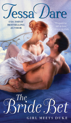
And then, can we take a moment to ooh and ahh over my new cover?
Here’s how the art looks, on its own:
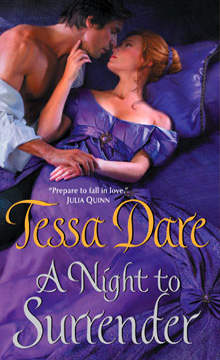
Some people like to say that all romance novels look the same, and there’s no thought whatsoever put into matching the cover with the contents of the book.
Those people (in this case, at least), would be dead wrong. So much thought and work went into this cover, on the part of my editor, the art director, and the artist – I’m so grateful to all of them! They really thought about the book, and it shows. The book is a fun, sexy, emotional struggle of wills…a Regency-set a battle of the sexes, if you will. And this pose was carefully staged to get that across. Just who is surrendering to whom, eh? I especially love that her eyes are open, and his are closed. I told my editor that I love clinch covers (it’s the truth), but I like them best when the woman looks like an active, equal participant. 😉 My heroines always do their fair share of the ravishing.
Siiigh, at all that lush, gorgeous texture on her gown. Plus, their hair and eye colors are perfect. The heroine model even looks tall, which Susanna is. And yes, Bram’s shoulders are indeed that fine.
Now I’ll admit… At no time in the book do they roll around on a purple bed. But in one scene, she does wear a violet silk gown! Close enough.
And here’s how the cover will look in stores:

You can see this version has two exciting additions. One is that beautiful bronze stripe down the right-hand side, which not only perfectly matches the shade of the heroine’s hair, but is indicative of my very first stepback. (Q: How do I feel about that bronze stripe? A: FILLED WITH GLEE.)
Also, you’ll see there is a special label for the “K.I.S.S and Teal” campaign — every September book from Avon will carry this seal, which indicates Avon’s partnership with the Ovarian Cancer National Alliance. It’s a great campaign for a very important women’s health issue, and I’m honored that my book is a part of it. I’ll be posting more about it here on the site as the time draws near.
It’s probably obvious, I adore my new website and my new cover, and I’m just so glad that people more talented than I designed them both. Thank you, Croco and Avon!






April 5th, 2011 at 12:37 pm · Link
Another beautiful cover! What does the stepback look like?
The problem with ebooks is that the covers tend not to be as cool. I’ve read that “The Perfect Play” (with a HAWT Jed Hill on the cover) doesn’t even have the cover art on the ebook! Jed is a major selling point for the book!
April 6th, 2011 at 7:08 am · Link
The design for your website looks great. I love the soft colors. And the cover is absolutely fabulous (I was wondering if it had a stepback when I saw the gold stripe). It makes me even more excited about the book.