

|
Pictures Worth a Hundred Thousand Words–How my cover art came to be
|
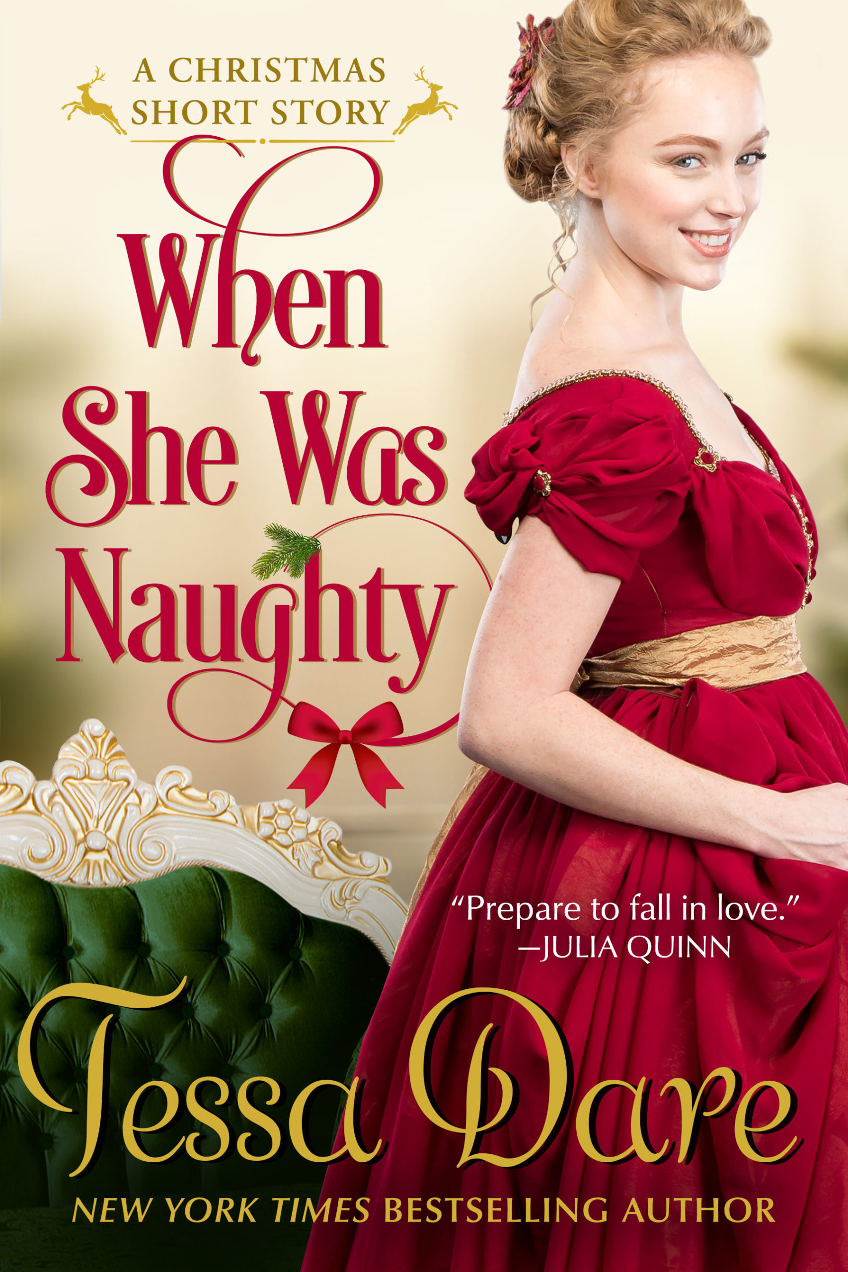
I’ve had so many compliments on the lovely cover art for this trilogy, and it’s not hard to see why. They are gorgeous–bright colors, beautiful models, full of rich (and accurate!) detail. I knew just from looking at them that a great deal of time and attention went into them, but the process behind cover art is often a mystery to the authors and readers.


About a month or so ago, I had the delight of hearing from the cover artist who painted the cover images. Her name is Doreen Minuto, and she was kind enough to take time to explain the process to me, step-by-step. Combined with what I already knew from my editor, here’s the story behind these lovely covers.
It all starts with what’s called a cover conference. The editor, art director, and sales department all sit down together and talk about what look and feel the covers should have. Before the conference happened, my editor asked if there was anything I had in mind or especially did or didn’t want on the covers. I don’t have cover approval in my contract (very few authors do), so I knew this was mostly a courtesy, but it was nice that she asked! My only request was that, since the titles of the books all referred to the heroines, they use a woman somewhere in the cover. Whether by herself or with a man, I didn’t care. I just hoped they didn’t slap the title “GODDESS OF THE HUNT” over a bare male chest, because that would look…weird. Not to mention, illogical.
Thankfully, that didn’t happen!
At the conference, I gathered from my editor that they decided to shoot for an “elegant, upscale” look–no clinches–and that they wanted a movie-poster feel with models who closely resembled the characters, similar to the covers for Julia Quinn’s “Two Dukes” duet. I was asked to supply a little dossier of my characters’ appearances. I included their ages, hair/eye color, build, the type of clothing they wore, the key props or objects that they might carry, and even their personalities. I attached some of the photos I used for inspiration. I also included information about the books’ settings.
Here’s what happened next, in Ms. Minuto’s words:
[The Random House art director] decides which artist does the cover and has the most input with the artist… The editors, and art directors usually decide location and costumes which would best describe the book. The feel of the book, location, costumes, look and personalities of the characters are given to me and I hire models and do research on the location to best portray the story.
(As a side note: From the first time I saw each cover mockup, I was amazed at the attention to detail. The models look so much like the heroines’ descriptions, and they’re wearing colors they wear in the book. The landscapes are very accurate too. I was especially pleased that they even got the right kind of ship on the Siren cover!)
Even though these are “paintings,” the images started as photographs. Doreen explains:
The photo shoot is the most fun and challenging. You have one hour to “get the shot”. I hire my models, and select costumes of the period from a costumer. When I arrive at the shoot in Manhattan my models and costumes are waiting for me. I have already planned a sketch of the pose, location, and lighting which is first approved by the art director. I then work this out with the photographer. I’m sort of the movie director of all these talented people whose professional input can make or break a photo shoot. Many alternative looks are covered in the shoot just in case the art directors change their minds. It’s a wonderful creative process.
I was a traditional painter and have moved on to be a digital artist. The photography and image is done digitally. The programs are so sophisticated now you can design and paint on the computer. A final sketch is approved or improved by the art director before I get to sit down and do the painting.
I asked Doreen if she had a favorite of the three, and this is what she said:
Hard to say which one is my favorite. Each one has a piece of the image I was happy with, solving problems in composition, color, etc. while telling the story. The color scheme was picked out by the art dept. to make a pleasing trio.
Doreen and I both agreed that she has a very cool job. 🙂 You can see more examples of her work at her website.
I got to see the mockups of the covers, and then the original “final” versions. Which ended up being not so final. The biggest changes were in the Goddess cover. You’ll notice it was purple, with script font and little flowers and such. I even got coverflats of this version — the purple oval had a shimmery coating. It was very pretty.

But here’s another interesting part of the process. The sales reps take these covers out to the buyers, and the buyers have a lot of influence. In the case of my cover, one of the major accounts indicated they would place a significantly bigger order if the cover was tweaked. That’s how it ended up red instead of purple, with brighter colors and the title in block font, embossed in gold foil. Lucy wears red all through GotH, and everyone knows a foil-embossed cover is THE thing to have, so I couldn’t have been happier! I really think the bold, bright color and her slightly saucy expression capture the mood of the book so well. I’m very grateful to the Ballantine art department and Ms. Minuto for all their hard work.
So that’s the story of how my lovely covers came to be. At least, as much as I know of the story. And as pretty as they look on the computer, they’re even more beautiful in person. Love the foil! Ooooh…shiny. 🙂
Do you have any favorite romance covers? What is it about them that appeals to you?


August 5th, 2009 at 8:09 am · Link
Very Cool! Thanks for this info….I love the covers and in finishing GOTH, I was also impressed the image on the cover so matched the description in the book, even down to the red dress 🙂
Colleen
August 5th, 2009 at 9:42 am · Link
Tessa,
Thank you for this information. I’ve always wondered how covers come about. I never would have guessed the buyer had a say in them. Do you know anything about the models? It seems they never get credit.
Tina
August 5th, 2009 at 10:06 am · Link
Awesome post! It’s rare to get to such nitty gritty details from the art department; very interesting to hear the process from the cover artist’s perspective.
August 5th, 2009 at 10:51 am · Link
The covers are beautiful. Some of my favorite covers are Candice Hern’s “The Merry Widow” series. The covers were actual paintings from the period. Like your covers….just the lady of the story.
August 5th, 2009 at 2:52 pm · Link
Very cool! Thanks for sharing.
P.S. I saw your book today at Walmart here in Georgia!
August 5th, 2009 at 3:24 pm · Link
@Colleen: First, thanks for reading GotH! Sadly, I think a lot of us have just gotten used to cover images that have little to do with the contents, sometimes. and as you say, it’s surprise when it actually matches up! But a good one. 🙂
August 5th, 2009 at 3:33 pm · Link
@Tina Louise: Tina, no I don’t know anything about the models. But maybe if Doreen gets back in touch, she can tell me. Good question!
@Louisa Edwards: Glad you liked it, Louisa! I knew so little about the process before I sold…it is rather shrouded in secrecy, isn’t it? 😉 I thought it was really cool of Doreen to explain it all to me.
@Carol: I know exactly which covers you mean, with Candice Hern. Yes, they were beautiful!
@Lori Brighton: Thanks for dropping by, Lori! Your new cover is gorgeous. And I love book sightings!
August 29th, 2009 at 9:15 pm · Link
I really like the cover art for your books. I like that they are beautiful, and not cheesy or overtly um… how do I say? Vulgar? Anyways I think they are very classy and lovely. I also love that you gave us such a good picture of your heroines. I am the type of person who likes to put faces on the characters I am reading about and getting that picture of them is often difficult for me, but you have helped me a great deal with your great book covers!
July 29th, 2010 at 5:17 pm · Link
Just love your books! The Goddess of the Hunt was a treat! I was absorbed by the story and the characters……I even laughed out loud at times….but most importantly, the story was so romantic and touching. I am continuing to read all of them! The covers are beautiful! You are so very talented. I hope to keep reading your books for years to come!
September 18th, 2010 at 9:16 pm · Link
I love the covers, but am disappointed that Sophia was not wearing the “stripes” dress that so confounded Grey. 😉
November 30th, 2010 at 8:18 pm · Link
to be honet, I like the covers so much, in the first sight , you know., especially Goddess of the hunt’s cover 🙂
January 27th, 2013 at 9:46 pm · Link
Thank you for sharing the info. I just finished reading Godess of The Hunt. It is great and I could not put it down! The pictures on covers are one of the reasons I choose the books i read, and I love it when the cover picture matches the main character.